The forms look great by default on desktop. However, on mobile,
1) The fields become tiny and hard to read.
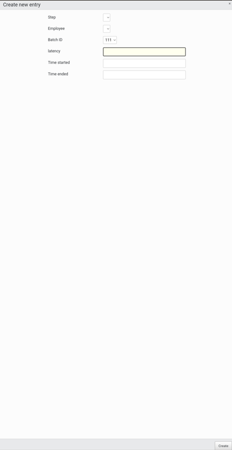
2) Clicking in one of them to enter data (Chrome on Android) causes a jarring zoom that hides all the field names.

Is there a batteries-included way to make the forms respond better on mobile?
If not, I think the desired behaviour would be:
Adjust the size of the grey header and footer bars to match the size of the field label + field input, so that you're using all of your screen real estate productively. Something like this (forgive me):
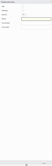
Additionally, the field inputs and labels could be adjusted to make use of any available width.